
Generation Indolent?
Rumors of the death of conscientiousness have been greatly exaggerated


If you spend too much time online, you’ve probably seen it already. And let’s be honest. You’re reading a Substack post. So you probably scroll social media more than you’d like.

It’s the latest ominous graphic in the recurring swells of worry about people under 40, who’ve been broken by cell phones. How can the world continue to function with conscientiousness rates in the cellar and neuroticism on a steep rise?
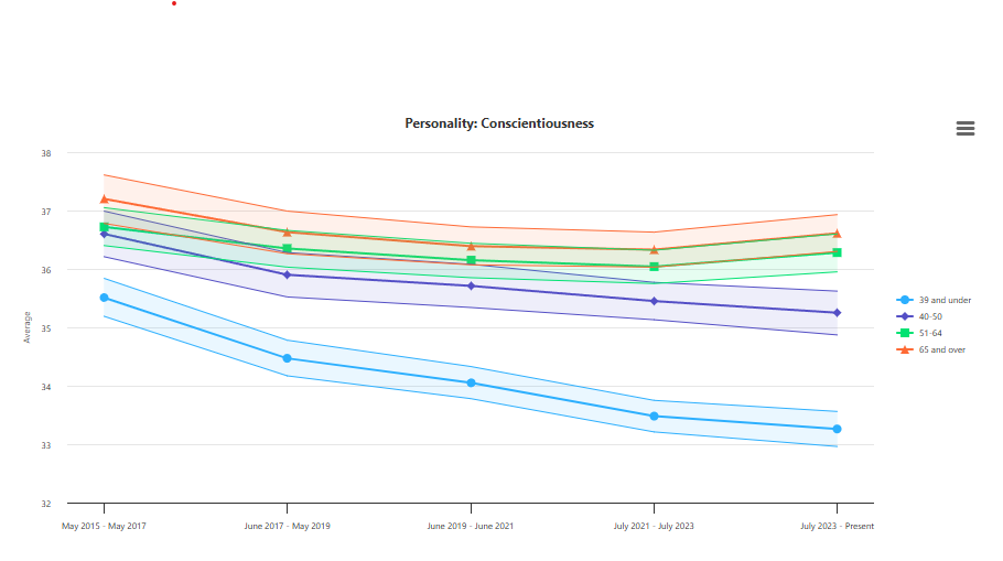
The trouble is, as a few people who dug into the actually survey data behind this graphic pointed out, the changes in average conscientiousness scores among survey takers was actually pretty small. The average score dropped a few points on a scale that runs to 45.
This seems like a case of a change being statistically significant, but probably not practically significant.1 Or, teasing out the potential outcomes requires looking into the data a bit more deeply. So, what exactly did FT’s John Burn-Murdoch graph in his figure?
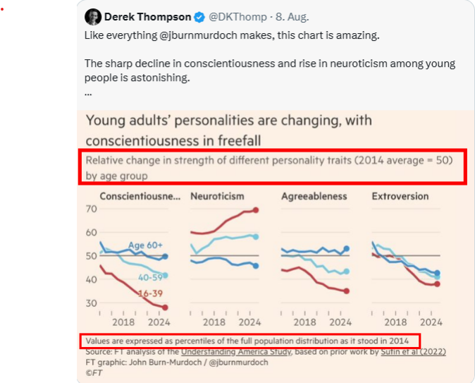
I’m on the fence with regard to whether this was an honest effort to find an otherwise hidden pattern or choking the statistics until it spit up something sensational. Burn-Murdoch didn’t plot conscientiousness scores but rather where average score for people under 40 changed with respect to the initial distribution of scores. That sentence is a bit much for most people to wrap their heads around, so we’ll look at comparable case and work back to Burn-Murdoch’s figure.
Most of us have run into percentile scores in at least one area of our lives. Young parents learn where our kids rank in terms of other children with regard to height and weight at yearly check ups. My two and a half year old, for instance, is in the 91st percentile in height. He’s literally taller than 91 percent of kids his age. SAT scores are similar. Scoring in the 1400s in the old SAT put a student somewhere around the 95th percentile of students. Good enough for a high-ranked state school, but not the Ivies (ask me how I know!).
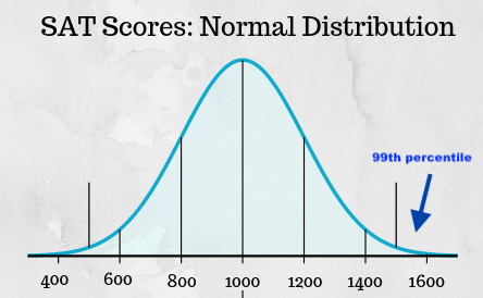
The 50th percentile is called the median. That’s the amount where half of the data points are higher and half are higher, the equivalent of a 100 IQ score. That’s where the 50 comes from in Burn-Murdoch’s figure.
So, what he depicts is people under 40 going from the 40-something percentile to the 30th percentile with regard to the 2014 spread of scores. What that means is that the median young adult today is less conscientious than 70% people in 2014. Sounds dismal, but when we look at the actual distribution of conscientiousness scores, things look different.
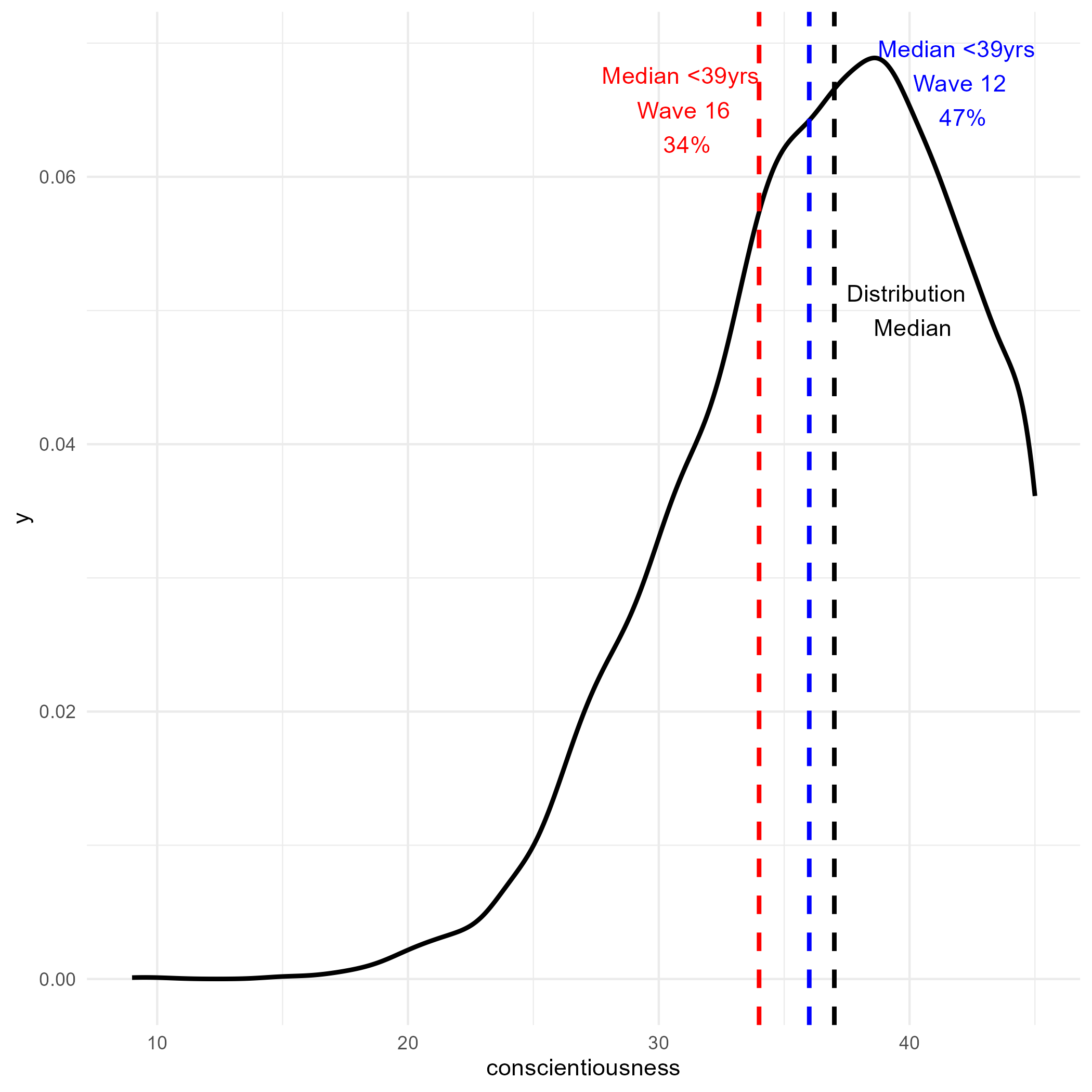
The issue is two-part. First, you can see that the distribution of conscientiousness scores is what’s called left-skewed. And it’s very narrow. The vast majority of people are moderately to highly conscientious. It’s like being in the 30th percentile at Harvard. You’re not exactly what people would consider “below average.”2
The second problem is that, by sticking with the 2014 distribution, Burn-Murdoch obscures how the distribution itself has probably changed. I say “probably,” because I can’t get the survey data to process perfectly in R, so I couldn’t weight it probably for a nationally representative analysis. Sticking with the weighted numbers provided by the survey’s creators, we see changes across the age cohorts. Young adults aren’t unique when it comes to a measurable decrease in exceptionally conscientious people.
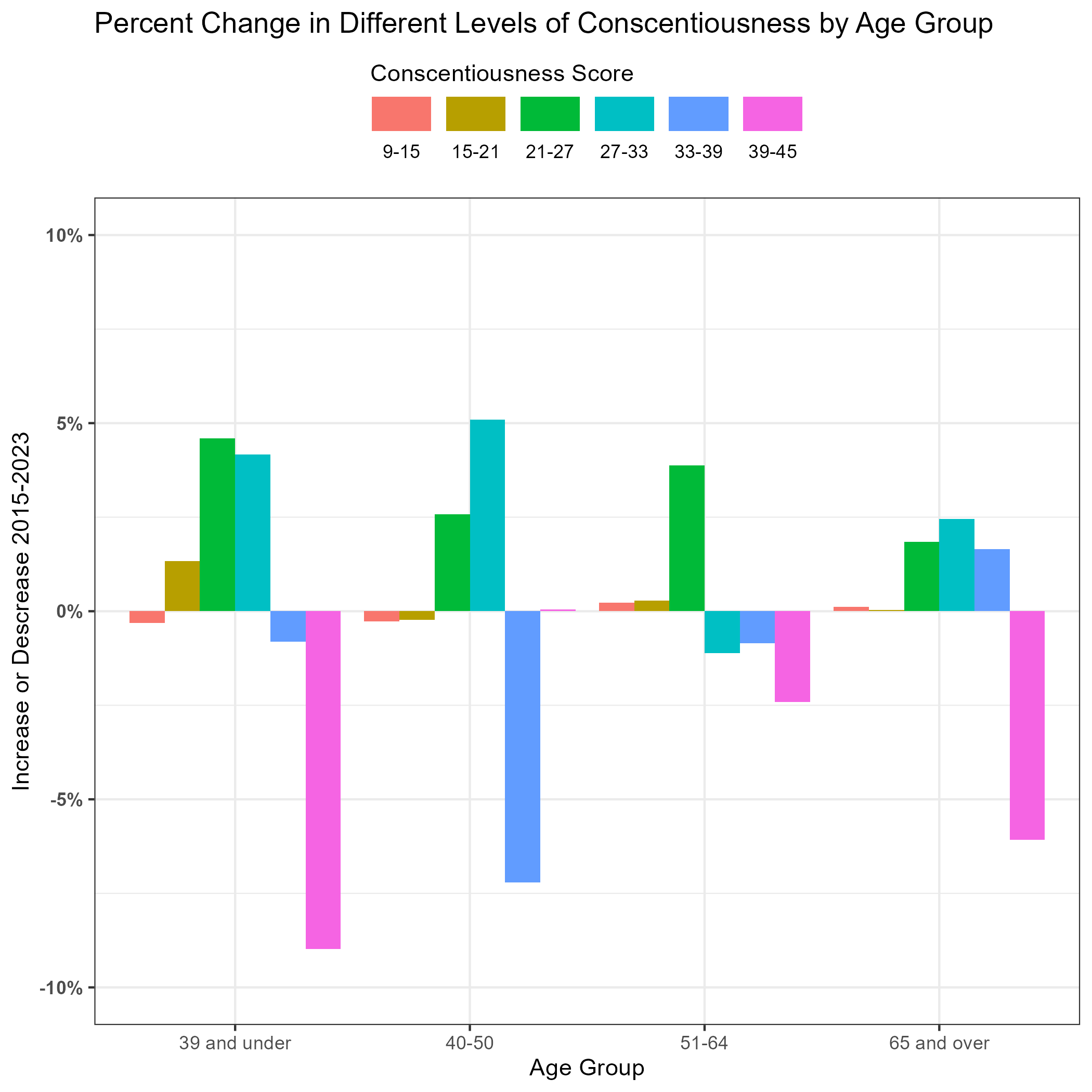
In my view, there could actually be something to this data. Sure, the absolute changes in average conscientious scores are pretty insignificant, but we might have reason to worry about the decease in the number of people scoring at the high end of conscientiousness scale. If these are the citizens who disproportionately shoulder the demands of community and democracy, than a relatively tiny decline could be a big deal.
Unfortunately, that’s not an apocalyptic story, but rather a nuanced one that requires a lot more care (not to mention additional investigation to corroborate it). Every data visualization is a model. And some models provide insight and provoke us to explore further, while others can pander to our preconceptions about the world. I know which kind I’d prefer to see more of.
As fellow Substack points out, this translates to tiny effect sizes
An additional risk here is that the mean will be smaller than the median, because it is pulled by the long tail to the left. I don’t know if the means or medians were presented, but using the means would have exaggerated things further.
 | A guest post by
|